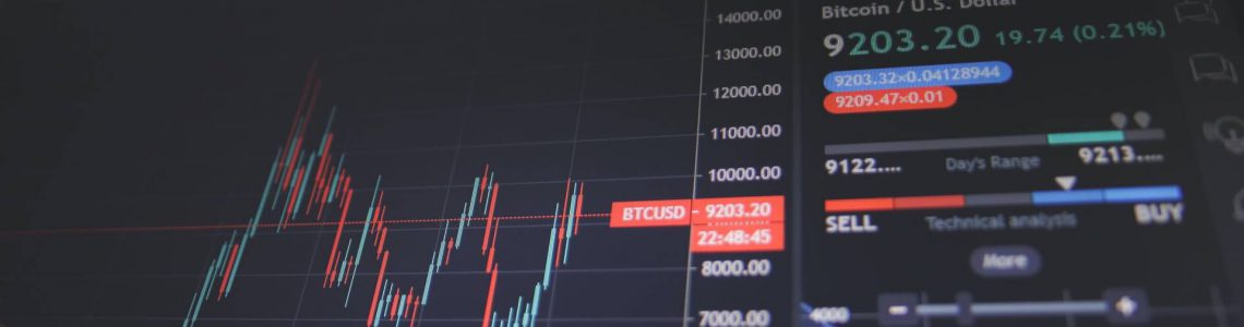
If you want to learn how to read crypto charts, this article can surely help you! Understand patterns, trends, and factors that run the financial markets.
If you’re planning to get into cryptocurrency trading, learning how to read crypto charts is a handy skill to have. It might be difficult at first, but once you understand the basics, you’ll get the whole concept in no time.
You’ll be able to read trends, observe highs and lows in real-time, and predict prices. These elements will help you make the best decisions when it comes to crypto trading.
Contents
What Are Crypto Charts
A crypto chart is a snapshot of price action which happens over a specific time period. It could be from seconds to minutes, days to weeks, or even months to years.
The price action is represented by graphs, lines, bars, and candlesticks.
There are various elements in a crypto chart, including each timeframe’s spot open price, highs, lows, and close.
Let’s go over some graphical representations of the price action.
Line Chart
This is a graphical representation where the line connects the closing price of each day. It’s a 2D chart that can show different timelines. The value of assets is represented by a single line that goes up or down.
It’s one of the first visual representations to be used in financial markets, not to mention the most commonly utilized. It’s simple and easy to understand; that’s why it’s most suitable for beginners. What’s more, many traders worldwide prefer this representation.
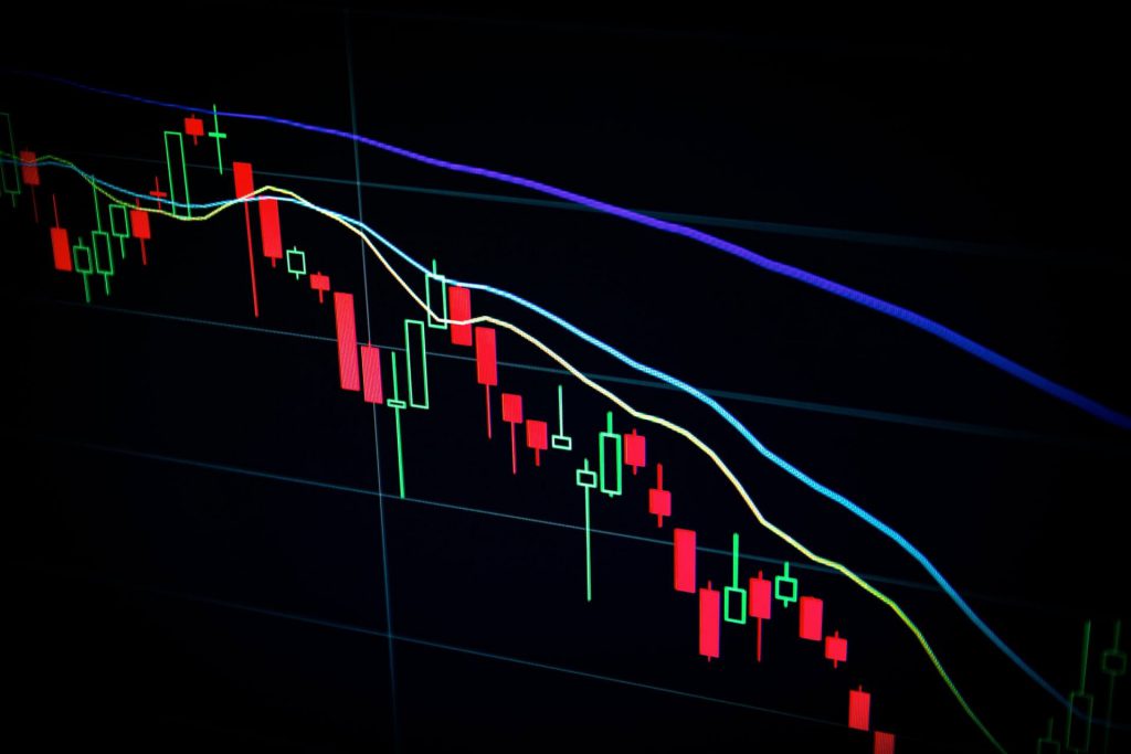
Candlestick Chart
This is a visual representation of four inputs – open, high, close, and low. It’s one of the most popular and widely used graphs in financial markets. When you see this chart, you’ll immediately notice two colors which are green and red.
The green color or the candlestick’s body represents the open and low. The black line at the top that looks like the candle’s wick represents the highs and lows.
It’s important to note that the green-colored candles are bullish ones, indicating that the price has increased during the particular timeframe.
The red-colored colored candles are bearish candlesticks. They indicate that the price has decreased for that specific timeframe. The black line at the bottom of the green and red candlesticks represents the closing price.
Moreover, candlestick charts, also known as Japanese Candlestick charts, can represent the emotion of traders when it comes to buying or selling an item. If you’re able to read candlestick charts correctly, you can identify different patterns and can predict to some extent how the market will move.
Chart Patterns
We can classify the patterns into two main categories: Bullish Reversal Patterns and Bearish Reversal Patterns.
These are the Bullish Reversal Patterns:
1. Hammer Candle Pattern
This is a one-candle pattern that has little to no upper shadow or line. The lower shadow is also noticeably two to three times longer than the upper one. Hammer is a bullish reversal pattern that takes place at the bottom of the downtrend.
This pattern signifies that the sellers came in strong when the market opened, took over, and overwhelmed other traders. This resulted in a decline in the price. However, after the surge of selling, the number of buyers took over, leading to the closing price being higher than the opening price.
2. Bullish Engulfing Pattern
This is a two-candle pattern where the first candlestick is bearish or red and the second is bullish or green. The body of the green candle completely engulfs the first one.
This pattern means that the sellers are in control in the bearish candle, while in the bullish candle, the buyers are taking over. Bullish Engulfing Pattern signifies that there’s a high chance for an upward trend to come.
3. Morning Star Pattern
This three-candle pattern occurs when a doji appears at the bottom of a move and is followed by an ascent in price. A doji is a candle with a very minute to nobody and has little wicks or shadows.
The first candle is bearish, the second has a very small range, and the third is bullish.
In the first candle, the sellers are in control as the price comes to a close. On the second candle, the buyers and sellers relatively cancel each other out. In the last candle, the buyers completely overtake the market, closing the price at a higher value.
Below are the Bearish Reversal Patterns:
1. Shooting Star Candle Pattern
This one-candle pattern is the opposite of Hammer. This bearish reversal pattern can be recognized because it has little or no lower shadow, with the upper shadow being two or three times longer than the bottom one.
This pattern appears at the peak of an upward movement before a price decline. When the market opened, the buyers were in control, and the price was high. But this proved to be too much to handle as the selling momentum overwhelmed the bulls.
To put it simply, the strong push by the buyers at first was met by strong resistance, and in the end, the sellers took over.
2. Bearish Engulfing Pattern
This is likewise a two-candle pattern, with the first candlestick being bullish or green and the second one bearish or red. The bearish candle is significantly larger than the bullish.
This pattern can be seen when the buyers are in control during the first stage. Then the sellers are able to take over, and the price closes lower than the price of the first candlestick. The sellers are in control with this bearish reversal pattern.
3. Evening Star Pattern
You can easily recognize this three-candle pattern with the first candle being bullish. The second one, a doji, has a small range, and the third one is a bearish candlestick.
This shows that in the first candle, the buyers are in control. In the second one, it’s a fight between buyers and sellers. Lastly, in the third candle, the buyers’ momentum has been exhausted, allowing the sellers to take over.
What Is the Dow Theory
The Dow Theory was developed by Charles Dow, along with Edward Jones and Charles Bergstresser, in the late 1800s. It states that the stock market is a reliable measure of the overall business economy.
The finance markets take everything into consideration, including the prior prices and future details alike, to come up with the current assets’ prices. Multiple variables can impact the crypto market, including the demand and supply of specific items.
Furthermore, price movements are not random and can be predicted based on previous price actions and several variables. They can also follow trends, which is why learning how to read a crypto chart is an invaluable skill.
The Six Tenets of the Dow Theory
Let’s get into the details of The Dow Theory in this section.
1. Three Movements of the Market
- The primary movement of the market is called the “Main Movement.” It’s a major trend, can be bullish or bearish, and can last for a long time, even reaching a year or several years.
- The secondary movement is referred to as the “Medium Swing.” This occurs in a timeframe of medium-length that may last between ten days to a few months. Trends in the medium swing are measured in terms of primary price change.
- “Short Wing” is a minor movement in the market. It changes according to market speculation, from hours to months.
2. Three Phase of Major Market Trends
- Accumulation Phase: the period when intelligent investors start buying or selling assets opposite to the general perception of the market. In this span of time, there’s not much change in the price since there are only a few investors with enough knowledge.
- Absorption or Public Participation Phase: when the rest of the investors catch up to the trends made by the more knowledgeable investors.
- Distribution Phase: this happens after huge speculation in the absorption phase. As a result, investors begin to redistribute their assets.
3. The Market Incorporates New Information
As new information becomes available, prices of assets change as they reflect the overall feelings and expectations of traders and investors. As mentioned before, many variables affect market prices, such as revenue projections, product initiatives, and elections.
4. Stock Market Averages Confirm Each other
If two units are linked to each other or have the same assets, their prices are also related. If the price of the assets of Company A increases, for example, then the price of Company B must also increase.
If the prices of the two units are moving in the opposite direction, then the market trend might be reversing soon.
5. Trends Get Confirmed by the Volume
Volume is an essential factor when it comes to predicting market value. During an uptrend, the volume should increase with an increase in price. When there’s a downtrend, the volume should decrease with a decrease in price.
6. Trends Exist Until There’s Definitive Proof That They Have Ended
Trends in the market are still in trend despite “market noise.” Finding proof and determining a reversal in trend is not easy at all.
What Is Technical Analysis
Now that you understand Dow’s Theory and its six tenets, let’s move on to technical analysis.
Technical analysis is a tool or method used to predict the probable price of assets in the future. The better the technical analysis, the better you can predict price movements.
What Are Support and Resistance
Support and resistance are crucial components to reading crypto charts and a fundamental part of technical analysis.
Support is the level where the price of an asset tends to stop falling. Meaning, the price fails to go beyond it.
Resistance is the level where the price of an asset stops rising. It’s directly opposite to the support level.
Bottomline
Reading crypto charts may be a challenge initially, but you’ll surely get better at it with time. It will help you predict future price actions and market movements. In addition, there are a lot of variables that come into play when it comes to the prices of the assets.
It can help you a lot if you can read and understand different patterns that occur in the financial market since trends aren’t random. They can help you forecast future movements in the market.